Thursday 6 December 2012

Quick Tips: Shadows are not solid objects

Having been teaching for a few years now, it seemed like a good idea to share some tips, based on subjects that students often find difficult. I plan to make these ‘quick tips’ a regular feature on the blog. 


How to avoid common mistakes when depicting cast shadows

Below are examples of common mistakes many students make when drawing cast shadows.  These examples are drawn in soft pastels but the quick tips can be applied to other media.

This first image shows a jet black shadow with no graduation in tone.  This makes it look a bit like a hole in your drawing!


When drawing in colour remember that shadows also contain colour they are never completely black, although in some cases a touch of black may be needed.  Shadows also graduate in tone, the darkest at the base of the apple and getting lighter the further from the source. 


This second image shows an outlined shadow that has also been drawn before the table surface was added and has been shaded in using curved marks that give the impression of a solid object.

Shadows are not solid objects.  Please don’t try to draw them as if they were.  I don’t recommend outlining any part of your drawing but especially not shadows.  Draw your solid objects first; the apple and table surface then add some background before adding the shadow. Without these elements the shadow could not exist in the real world and therefore cannot exist in your drawing.  Once you have the apple and table draw the shadow using colours that correspond to your composition and shading that follows the same direction as the shading used to describe the table surface.  Don’t be afraid to leave some of the table colour showing through the shadow this will make it appear less like a solid object and help unify the composition.  See below.


Happy drawing!
Remember to check back for more quick tips.

Monday 17 September 2012

Review of Basingstoke Art Club exhibition at Fairfields Arts Centre

REVIEW: Basingstoke Art Club exhibition, Fairfields Arts Centre, until September 29

Those who doubt the talent of our town should attend this exhibition, given that it’s a feast of fantastic art from Basingstoke’s own. 

Basingstoke Art Club has organised art classes for its members for an unbelievable 60 years, and they meet in Fairfields, so it is appropriate that they have finally been given the two gallery spaces to display their undeniably accomplished work.

Sandy Kendall’s gorgeous florals burst with colour on the facing wall of gallery one, which also hosts pieces by the renowned Cicely Drewe, three by Brenda Perkins and Sherry Edmondson’s fascinating multilayer monoprints. Texture plays a key role in the work of Ivan Bellchambers, whose Web of Life is a fascinating circular watercolour.   

I quite fancied living in the gorgeous cottage captured by Lindsay J Berry’s The Springfield Sundial watercolour, and having a debate with the wary Liz Smith in Character sketch by Anita Leatherby!

Jim Blackford’s fired clay animals are resplendent in the cabinet before you’ll move to admire Arti Chauhan’s work, and feel drawn in by Ron Turrell’s Gossip, in which a young woman peers from behind net curtains, looking at the gathered figures in the street outside. Ron’s oil piece Memories is a charming coastal scene, complete with colourful beach hits and a little red kite.   

I was also fascinated by the detail in Pauline A Hall’s Shells and Seaweed, in contrast to Shirley Kirsopp’s Reflections 1 and 2, and the paintings and drawings of Ros Morton and Rolland Q Parris, which wonderfully capture the seasons.
 
And it’s all brought to a stunning conclusion with Bethany Milam’s trio of pieces featuring the agonies and ecstasies of competing gymnasts, their tears, their prayers and their smiles.

It is impossible to view this collection and not be impressed. Well done to all involved for their fantastic demonstration of another element of what cultural Basingstoke has to offer.

Thursday 13 September 2012

More Than Sparrows

Lately I have been working on a sculpture of two sparrows made out of hair. 
 
The idea came from a sermon on Matthew 10 where it talks about the hairs on your head being counted, the Salvation Army Officer expanded on this surmising  that if God knew how many hairs are on your head he would know how many you left in your hairbrush that morning and how many lay on the hairdresser's floor.  This intrigued me and I began to look into using hair as a modelling material mixing it with glue and forming shapes.  I think this image was also partly inspired by a childhood memory of a poster with two sparrows on that had a paraphrase version of Matthew 10:31 on which I learnt by heart.

My hairdresser thinks I am mad having asked to keep my hair for the last two haircuts.  I was a little worried that I wouldn't have enough to finish both sparrows so had my hair cut a little shorter than I would have otherwise!   I also had a very odd parcel through the post containing some of a friend's black hair, which I used for the eyes.

For a lot of my work I use unusual or 'difficult materials' in a time consuming and intricate way.  I hope that this comes across in the delicacy of the final work.

sticking on legs and wings

testing his legs

 The finished sculpture

 ...and some close-up's

Tuesday 11 September 2012

Olympic Portraits

Well it is all over but you can continue to relive the Olympic rollercoaster with these emotive portraits.

Three of my portraits of Olympic gymnasts are now on exhibition at Fairfield's Art Centre. Selected by Andrew Buchanan as part of the Basingstoke Art Club exhibition. The show is open until Saturday 29th September 2012.

Gallery Opening Hours:

From Thurs 6th Sept to Thurs 20th Sept: Mons, Tues, Weds and Thurs 9.30am – 4.45pm.
From Mon 24th Sept: Mons, Tues, and Thurs 9.30am – 8.00pm. Weds 9.30am - 6.00pm.


Fri by appointment.

Sat 29th Sept 9.30am - 1.00pm.
Closed Bank Holidays.


Admission Free


Victoria; Individual All-Around
Mixed Media
2012

 
Hannah; Vault
Mixed Media
2012

 
Alexandra; Beam
Mixed Media
2012
 

Friday 10 August 2012

The Crying Games

Well it seems that the whole country has got Olympic fever.  It has defiantly made captivating viewing and artists across the UK have been inspired, myself included.  I have always enjoyed gymnastics as the closest you can get to dance (my second passion after art) in the world of sport.  However I have not gone down the obvious route of drawing the gymnasts in action, instead my attention was caught by the in between moments, when they were waiting anxiously for scores, crying, being comforted by their coach or celebrating with team mates.  With the live round the clock broadcast, it seemed to me that there was more coverage of these moments than from previous games where we probably received a more edited version.  This behind the action view provided fascinating TV, as I joined in the agonised wait for results, empathised and celebrated along with the athletes. The effort, dedication and hard work that had gone into their routines shone through in their faces and reactions, revealing individual personalities and moments with more drama than a year of soap stories.  It was this range of emotions that inspired me to create a series of drawings recording what the press have called the crying games.  

Here is a view of some of the work in progress. 
All Images © Bethany Y Milam

Tuesday 7 August 2012

Need to Create

I have been considering what is so addictive about making art and being an artist.  Many artists talk about their need to create, as if it were a basic need like eating or sleeping. What is this need and where does it come from?

For me the most exciting part of being an artist is the thrilling moment a new idea falls into place, the eureka moment when the idea for an artwork pops into my head.  As well as the slower process of thinking about how to go about making something on a particular topic and exploring and developing ideas until they gradually start to come together into a coherent form.  I just love the excitement of the moment when I am on the cusp of starting a new piece, when it is all I can think about and with a flurry of frantic activity I race around the studio setting up materials, sketching and making notes.  The difficulty comes in keeping this momentum going when everyday life gets in the way.

Sunday 1 July 2012

A year of Daily Doodles

June 2011 


July 2011

August 2011

September 2011

October 2011


November 2011

December 2011


January 2012

February 2012

March 2012

April 2012

May 2012

June 2012

Sunday 6 May 2012

Mis-information at Fringe Arts Bath

I have had a sculpture accepted for Mis-information exhibition at Fringe Arts Bath.

Curated by Diana Ali

Friday May 25th – Sunday June 10th
Opening night Friday May 25th 6-9pm
Fringe Arts Bath What you see isn’t what you get.
Are newspapers fair and accurate or do we get off on the scandals? Taking the concept of hidden truths, misquotations, rumour and gossip, the featured artists explore ideas of being out of the loop, lying, pseudoscience, factoids and conspiracy theories. Over twenty artists are exhibiting work in film, photography, installation, drawing and painting.

The Impossibility of Putting the Toothpaste Back In the Tube Once Squeezed
The Impossibility of Putting the Toothpaste Back In the Tube Once Squeezed © Bethany Y Milam

Sunday 5 February 2012

Poppings


Do you know that feeling; of having so many ideas in your head that you just can’t think straight and you don’t know what to do first? That has been me for the last few days.  Ideas for a myriad of paintings, drawings, sculptures, an artist’s book, and illustrations, even a whole children’s book have flooded into my head;  Much in the manner of ‘Poppings’ as described by P. Kivy in ‘The fine art of repetition: essays in the philosophy of music’.  There just isn’t enough time to thoroughly explore them all in order to judge each idea’s value.  I am already feeling pressed for time with preparations and paperwork for my Adult education workshops to do (why does everything require a load of paperwork these days?).

Tuesday 17 January 2012

Daily Doodles

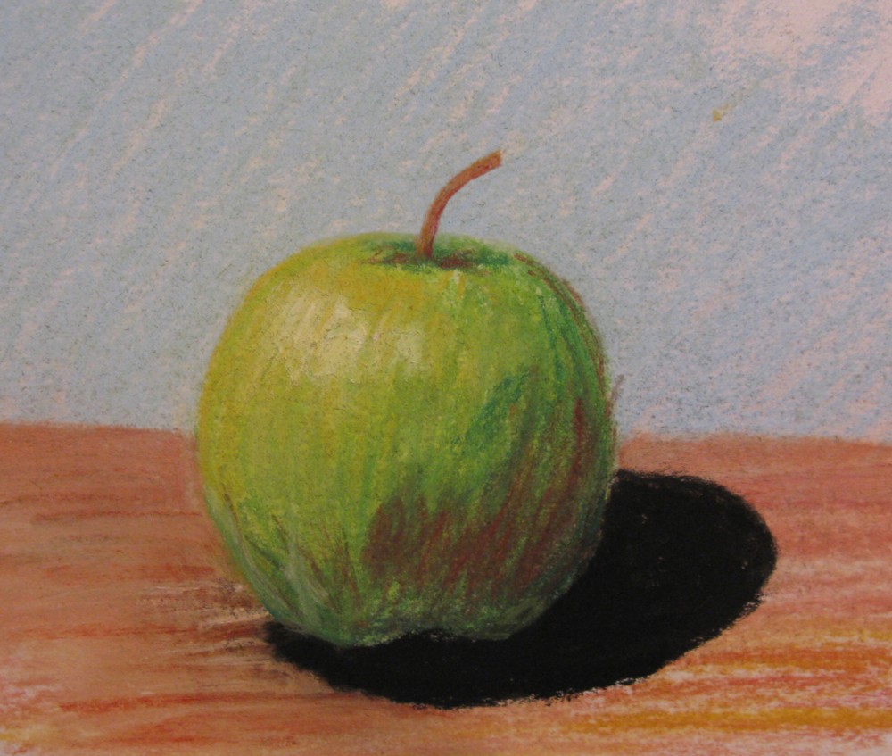
Daily Doodles is an ongoing project in which I create a drawing on a 2inch square piece of paper every day.  Each drawing presents a snapshot of one day either depicting an event, feeling, an object, scene or image from the day, a prayer, wish or thought, a journey taken or an object collected.  The doodles differ in style being abstract, illustrative, realist, cartoon-like or surrealist, they are mostly in 0.05 black pen but other media are used including found objects, paint, coloured pen, pencil and collage. Seen together they provide a gateway into the subconscious over an extended time. 


The idea of making small daily doodles originally came from a project into doodling and the active imagination that I started in university, conceived as a map of thinking and a trace of daily life.

University Doodles:


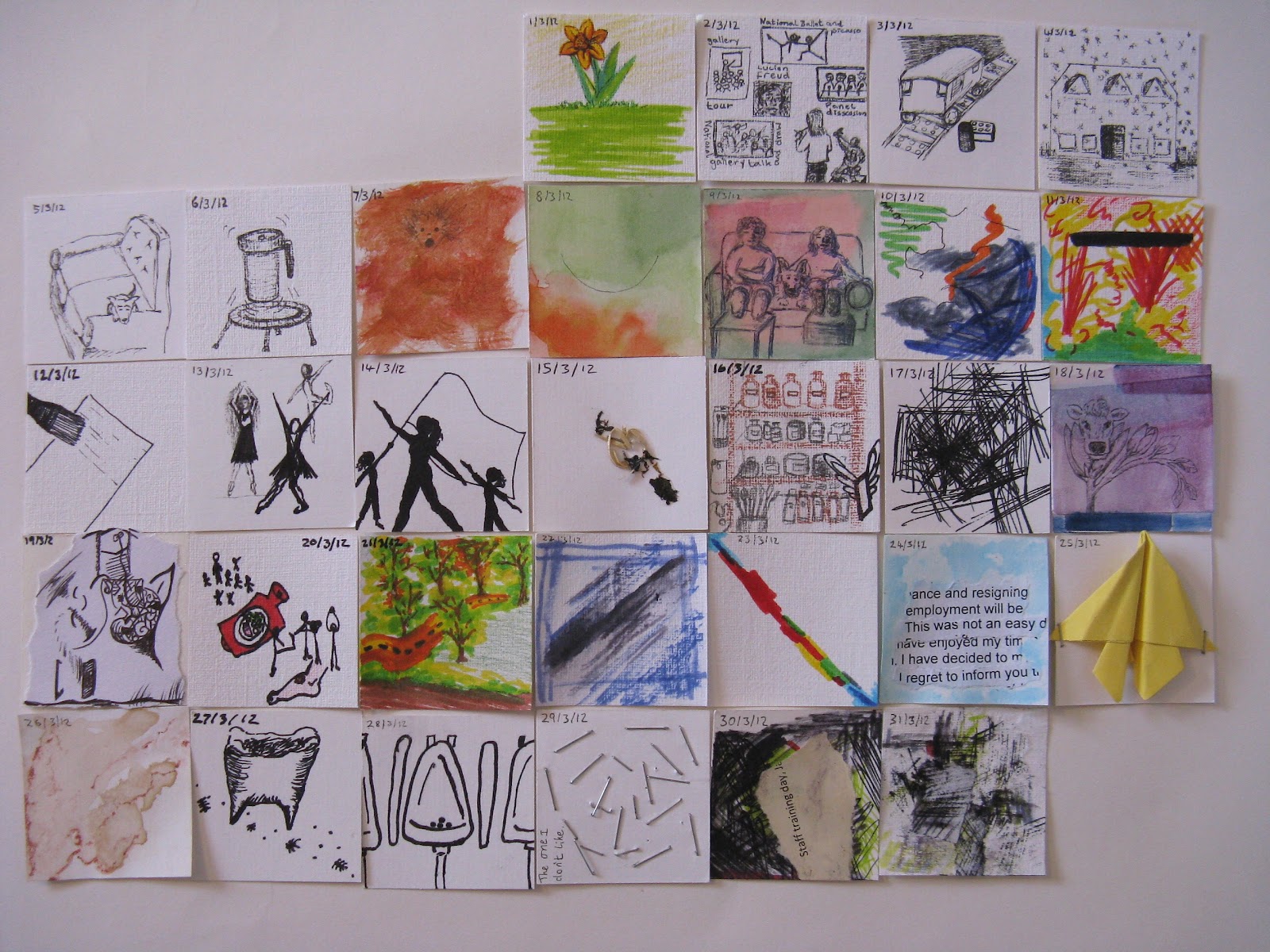
I later returned to this format in 2011 creating a month of doodles to be exhibited at 'HerStory' a Women's Work exhibition in Winchester. 


Daily Doodles: March 2011
Each drawing presents a snapshot of one moment but seen together they provide a gateway into the subconscious over an extended time. Viewers are encouraged to construct their own meanings from the often ambiguous imagery.
Since June I have continued this process of making a drawing on a 2 inch square of paper everyday.  It was suggested that an explanation would be helpful in making these doodles more accessible and so I have also started to write on the back. Although I am still unsure how much I want to say and may choose to edit or omit this written information.


I returned to a doodling approach nearer to Jung’s Active Imagination Technique in the following doodles.  I call these ‘real’ doodles rather than the depictions or illustrative type.  To start I just put pen to paper and make a mark, which leads to another and so on, the trick is to not think about what I am doing (doing something else at the same time can help e.g. listening to the radio or TV) when I get near to finishing the doodle I allow myself to consider what I have drawn.  I often begin to see things in the drawings and it can be quite surprising what subconsciously comes through in the doodle.   Sometimes I leave them as they are, although I usually continue working on them with this more informed view until they feel finished.


On Thursday 26th I went to AP Fitzpatrick, Bethnal Green, London to purchase some supplies for my upcoming egg tempera workshops, and also couldn’t resist a Redot aluminium panel to experiment with myself.  This little shop is an absolute gem, resembling something between an apothecary and an old fashioned sweet shop, with shelves packed high with raw pigments and other materials both traditional and modern the staff are always extremely helpful and knowledgeable.   http://www.apfitzpatrick.co.uk/home.htm
 
I decided to take my 2” square of paper with me in a bag with some pencils as I walked around London, visiting galleries and getting lost in China Town.  The idea being that the movement would cause the pencils to create marks on the paper documenting my journey.  Unfortunately this did not work as well as it had done in the past, (when I discovered this method by accident) and so later, while on the train home, I worked from the few initial marks the process had made to develop the drawing. 

the doodle for 27/01/12 was drawn with my eyes shut, thinking about how I had felt that day to guide my hand.  Upon opening my eyes I edited the mark-making by deleting what I felt were less successful marks (marks that in my opinion did not express what I wanted) with a large marker. The result is I feel quite striking.


Adding Colour
I decided to begin using colour in my doodles, mostly in a symbolic way to express feelings and moods.  Although there are conventions for the symbolic use of colour and how colour is interpreted there is also much variation between cultures and individuals.  For example in the UK black is normally associated with death and mourning while in Chinese, Vietnamese, Korean, and Indian tradition, white is the colour of mourning.  Even in the same culture one colour often holds multiple and sometimes contradictory meanings.  I am reminded of Kandinsky's use of colour and his personal synesthesic connotations of different colours to moods, shapes and sounds:

 
“(yellow is) warm and powerful… angry looking”
“Green expresses absolute tranquillity and complete repose”
“The effect (of Blue) is self-centering… purity and longing for the infinite… apathy and silence”
“Red is considered a lively warm colour and arouses increased unease... Red tends to concentricity and signifies male maturity”
- Rhyme or Reason in Colour Symbolism? A Biophysical Analysis of Kandinsky’s Colour Theories, by Ya’acov Y. Leshem

 
This has led me to consider my personal use of colour symbolism:
Green = positive, happy, tranquil, quiet, cheery
Red= busy, angry, happy, fun, jovial, hectic, active
Blue= calm, tired, cold, dreamy
Black = bad mood, depressing, gloomy, miserable, tense
Yellow = happy, hot, busy
Orange = stressed, nervous, anxious, panicky, busy, hot, hectic, annoying
Purple = happy, peaceful, joyful
Turquoise = analytical, composed
Brown = mundane, bored, everyday stuff, safe
Grey = drained, fed up, weary, sapped
Not all of these descriptions apply all the time to the colours I use, but they are a general guide to my personal associations to colour.